
Color Coordination Basics: A Reference Guide for Everyday Outfits

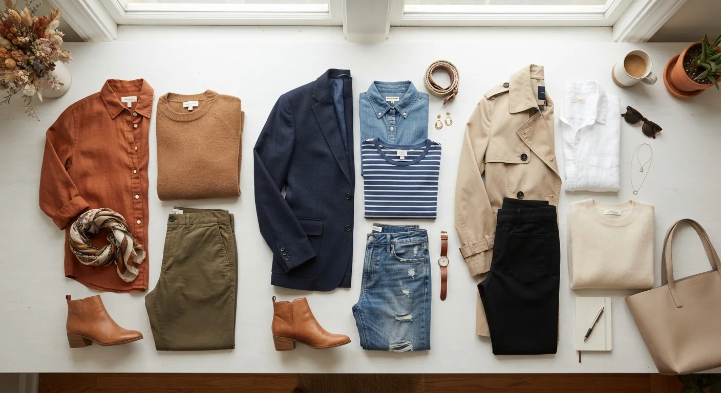
Photo: UltraSearches.com | Search Results You Can Trust editorial
The Color Wheel at a Glance
The color wheel is your quiet superpower when getting dressed. It organizes colors into relationships - and understanding those relationships is what separates a pulled-together outfit from one that looks accidentally mismatched.
Hue
The pure form of a color as it appears on the color wheel, before any white, black, or gray is added. Red, blue, and yellow are hues.
Tint
A hue with white added to it, making it lighter. Blush is a tint of red; baby blue is a tint of blue.
Shade
A hue with black added to it, making it darker. Burgundy is a shade of red; navy is a shade of blue.
Tone
A hue with gray added to it, which reduces the color's intensity without making it dramatically lighter or darker. Most everyday wearable colors are tones.
Undertone
The subtle warm (yellow, golden, peachy) or cool (pink, blue, ash) cast beneath a color. Undertones determine how colors interact with each other and with different skin tones.
Saturation
How vivid or muted a color appears. A highly saturated color is bright and intense; a low-saturation color looks dusty or faded.
Complementary Colors
Colors positioned directly opposite each other on the color wheel. When placed together, they create strong visual contrast and make each other appear more vivid.
Analogous Colors
Colors that sit adjacent to each other on the color wheel. They share similar undertones and naturally look harmonious when worn together.
At its core, the wheel is built from three groups: primary colors (red, yellow, blue), secondary colors (orange, green, violet - created by mixing primaries), and tertiary colors (yellow-green, blue-violet, and so on - created by mixing adjacent colors). For everyday dressing, you don't need to memorize every shade. What matters are the relationships between colors and how to use them deliberately.
The Key Color Pairings - Defined
| Complementary pair example | Blue + orange, red + green, yellow + violet |
| Analogous pair example | Teal, blue-green, and sky blue |
| Monochromatic approach | One hue in light, medium, and dark variations |
| Neutral anchor colors | White, black, navy, gray, beige, camel, brown |
| Recommended active colors per outfit | 2-3 maximum |
| 60-30-10 rule breakdown | 60% dominant / 30% secondary / 10% accent |
Most outfit color strategies fall into one of four categories. Here's how each one works in practice:
- Complementary: Colors directly opposite on the wheel (e.g., blue and orange, red and green). These pairings create high contrast and a bold, energetic look. A navy top with rust-colored trousers is a wearable version of this.
- Analogous: Colors sitting next to each other on the wheel (e.g., blue, blue-green, and teal). These feel naturally harmonious and easy on the eye - great for a relaxed, cohesive vibe.
- Triadic: Three colors evenly spaced around the wheel (e.g., red, yellow, and blue). Triad outfits can feel playful; the trick is letting one color dominate while the others accent.
- Monochromatic: One hue in multiple shades, tones, or tints (e.g., pale blush, dusty rose, and deep burgundy). This approach looks sophisticated with minimal effort and works in virtually every color family.
For more on balancing bold colors against quieter pieces, see our guide on neutral versus statement pieces.
Neutrals: Your Coordination Safety Net
Neutrals - white, black, gray, navy, beige, camel, and brown - technically sit outside or at the edges of the color wheel, but they're the foundation of most functional wardrobes. Why? Because neutrals pair with almost everything, allowing you to introduce color without chaos.
A useful rule of thumb: anchor one or two pieces in a neutral, then introduce color through the remaining items. A white linen shirt and khaki trousers form a neutral base; a cobalt tote or terracotta sneakers bring in color without overwhelming the eye.
If you're still building out your foundational pieces, our wardrobe-building guide walks through which neutrals to prioritize first.
Practical Rules Worth Keeping
60%
Dominant color in the 60-30-10 outfit rule
The 60-30-10 rule is a widely referenced proportion guideline used in interior design and fashion styling to create visual balance.
2-3
Ideal number of active colors in one outfit
Style educators commonly recommend limiting active (non-neutral) colors per outfit to maintain a cohesive, intentional appearance.
These aren't rigid laws - they're widely used guidelines that simplify decision-making:
- The 60-30-10 rule: Build an outfit where roughly 60% is a dominant color (often a neutral), 30% is a secondary color, and 10% is an accent. This ratio creates visual balance without a formula that feels stiff.
- Limit active colors to two or three: More than three competing colors can feel noisy. Patterns and prints that contain multiple colors count as one "color" in this calculation.
- Match undertones, not just hues: Warm undertones (golden, peachy, yellow-based) work together; cool undertones (blue, pink, ash-based) work together. Mixing warm and cool tones in the same outfit can feel off without understanding why.
- Use pattern as a color guide: A patterned piece already contains a built-in color story. Pull a solid color from the pattern to pair with it - this is one of the fastest ways to coordinate confidently.
These principles apply year-round and across seasonal wardrobe shifts - for more on that, check out seasonal wardrobe transitions.
Quick Reference Resources
Want to apply these principles to what's already in your closet? A wardrobe audit is a great starting point - it helps you see which color families you already own and where the gaps are. And when you're building layered looks, these color pairing rules apply directly: our layering guide shows how to stack pieces that share complementary or analogous tones without looking bulky.
Adobe Color Wheel
A free interactive color wheel tool that lets you explore complementary, analogous, triadic, and other color relationships visually - useful for planning outfit palettes.
Wardrobe Audit Checklist
A structured process for inventorying what you already own, which helps you identify your existing color palette before adding anything new.
The content on this site is for informational purposes only and is not a substitute for professional advice. Always consult a qualified professional for guidance specific to your situation.